
The approach to removing unauthorized sellers from Amazon depends entirely on whether they are selling counterfeit product or authentic product through an unauthorized channel. Here is how to tell the difference and what each situation requires.

One full-time Amazon hire covers one function. A fractional Amazon team covers the channel. Here is what each model actually costs and when each one makes sense.

Most brands get campaign management when they need advertising accountability. Here is what proper amazon ppc management looks like and why the distinction determines whether advertising spend compounds or dissipates.

A fractional amazon cmo runs the Amazon channel with full executive accountability without the full-time cost. Here is what that means operationally and when a brand needs one.

Most Amazon A+ content looks polished but fails on conversion. Here is what buyer-first module strategy looks like and how an amazon A+ content agency structures it differently.

Amazon Account Health runs two parallel risk systems. One tracks performance metrics. One tracks policy compliance. Both can suspend your account independently. Here is every metric that matters and the thresholds that trigger action.

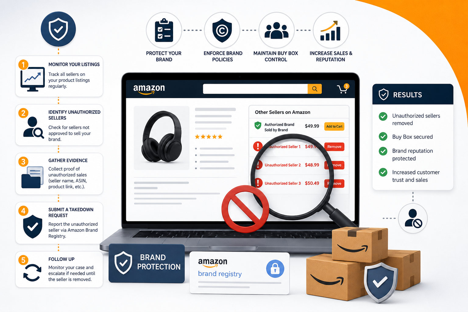
Amazon gray market sellers offer authentic product through unauthorized channels. Standard IP tools don’t apply. Here is how to identify them and what actually produces lasting results.

Three structural catalog errors cause Amazon listings to appear active while the search algorithm stops indexing them. Here is what causes each one and how to diagnose it.

Amazon contribution margin explains where Amazon profits actually disappear. Learn the difference between CM1, CM2, and CM3 and how to measure true SKU profitability.

Learn the Amazon product title best practices that drive indexation and CTR in 2026, from attribute order to mobile truncation.

