

Learn why Amazon image stacks drive higher conversions than keywords and how optimized product images improve clicks, trust, rankings, and sales.
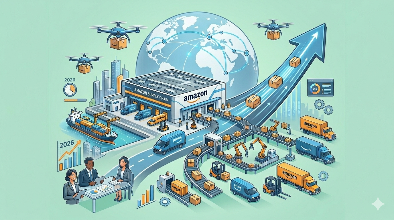
Discover how Amazon Supply Chain Services (ASCS) helps businesses scale faster with advanced logistics, fulfillment, and delivery solutions.

Here’s a **160-character SEO meta description**:
Data-driven Amazon listing optimization in 2026 helps sellers improve rankings, boost conversions, and outperform competitors using advanced tools and strategy.

Unlock Amazon Subscribe & Save in 2026: turn one-time buyers into recurring revenue, boost retention, and grow predictable sales for CPG and consumable brands.
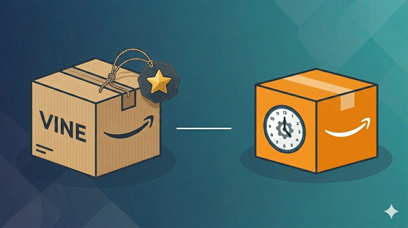
Amazon Vine vs Early Reviewer Program: see which builds social proof faster in 2026 and how Vine drives reviews, rankings, and conversions.
An Amazon growth agency manages the operational, advertising, and compliance systems that break when founders try to scale alone. Here is what that actually means.
In the 2026 Amazon marketplace, product discovery has shifted from traditional keyword search to AI-powered conversations and visual inputs. As the CEO of an Amazon services agency, I’ve seen brand owners struggle as shoppers increasingly rely on Rufus to ask natural questions, upload photos, or get instant recommendations. We are no longer only competing against other listings; we are competing against Amazon’s multimodal AI that “sees” your images, understands context, and decides whether your product deserves to surface. This is the Rufus-Ready Image Blueprint: Your visuals must now serve dual purposes — instantly convincing human shoppers while providing clear, machine-readable signals that help Rufus confidently match your product to buyer intent. If your images fail to deliver both, even strong keywords and PPC won’t save the listing. The New Discovery Reality: AI That Sees and Understands By 2026, Rufus has become a dominant force in how shoppers explore Amazon. It handles conversational queries, processes uploaded photos via visual search, identifies materials, styles, proportions, and real-world use cases, then surfaces relevant products or alternatives. When a shopper interacts with Rufus — whether typing “show me a blender that crushes ice easily” or uploading a kitchen photo — the AI scans your product images using computer vision and OCR. Your visuals are no longer just decorative; they are data sources that either strengthen or weaken Rufus’s confidence in recommending your item. To succeed in this environment, brand owners must ensure their image stack meets these core requirements: High-Resolution Clarity: Minimum 1000 pixels on the longest side (ideally 2000x2000+), with sharp focus that enables zoom and detailed inspection. Rufus extracts features like texture, dimensions, and functionality from clear images. Contextual Storytelling: Show the product in authentic lifestyle scenarios tied to buyer needs rather than sterile white-background shots alone. This helps Rufus map your item to specific use cases and emotional triggers. Fast and Mobile-Optimized: Compress images properly for quick loading on mobile devices while preserving quality, since most Rufus interactions happen on phones. Many brand owners we work with discover that weak visuals cause Rufus to overlook their products even when text matches the query. Building Trust Through AI-Friendly Visual Storytelling In an era flooded with AI-generated content, authenticity combined with strategic visuals creates your strongest competitive moat. Shoppers and Rufus alike make rapid judgments. Generic or low-effort images signal unreliability, causing quick bounces and poor algorithmic signals. To multiply trust and feed Rufus meaningful data, we recommend structuring your full image stack (up to seven main images plus A+ modules) with intention: Detail-Oriented Shots: Include multiple angles, close-ups of key features (e.g., materials, mechanisms, size comparisons), and infographics that visually call out specifications. Add descriptive alt text in A+ Content such as “Woman using high-speed blender with tamper to crush ice for green smoothie” to give Rufus extra context. Lifestyle Integration: Demonstrate real-world application across different scenarios relevant to your audience. For example, show the product solving specific problems or fitting into daily routines. This builds emotional connection for humans and contextual understanding for AI. Consistent Brand Identity: Maintain uniform lighting, color palette, composition, and style across all images. Inconsistency confuses both shoppers and Rufus when it tries to build a coherent product narrative. Our agency audits and redesigns image stacks for clients, often resulting in higher click-through rates, longer dwell time, and improved Rufus-driven visibility. Optimizing Visuals to Strengthen Algorithm Signals Amazon’s underlying A9/A10 system, enhanced by multimodal AI like Rufus and COSMO, now weighs image quality and relevance alongside text. Strong visuals reinforce claims, improve conversion rates, and send positive performance signals back to the algorithm. Here are actionable steps we implement for brand owners: Leverage A+ Content Fully: Use rich modules with comparison charts, infographics, short videos, and interactive elements (where available via Brand Registry). Well-executed A+ Content can lift conversions by 10-20% or more while giving Rufus additional data points about benefits and differentiators. Feature Visualization: Overlay clear, benefit-focused text on images (e.g., “Fits most 15-inch laptops” or “Waterproof up to 1 meter”) instead of generic labels. This helps both human scanning and AI parsing. Friction Reduction: Answer common objections visually before shoppers ask — size references, usage outcomes, material close-ups. This lowers cart abandonment and improves overall listing performance metrics that influence ranking. Avoiding the 2026 Visual Optimization Pitfalls Even solid PPC or keyword strategies can be undermined by visual mistakes that hurt both human conversion and AI understanding. In today’s environment, these issues are especially expensive: Overly Busy or Cluttered Images: Too much text, logos, or competing elements overwhelm mobile viewers and confuse computer vision systems. Keep compositions clean and focused on one primary message per image. Edge and Cropping Problems: Important details placed near frame borders often get cut off on different device ratios. Design with generous safe zones. Lack of Differentiation: If images blend in with category competitors, Rufus and shoppers treat your product as a commodity. Use unique lifestyle contexts and clear USPs to stand out without exaggeration. Ignoring Alt Text and Metadata: Failing to add descriptive, context-rich alt text in A+ modules misses an easy opportunity to feed Rufus better signals. We run regular competitive visual audits to help brands sidestep these traps and turn average listings into high-performing assets. Conclusion: Visuals Are Now Core to Discovery and Conversion As we advance through 2026, the boundary between search optimization, visual content, and AI-driven discovery has largely disappeared. Your images function as critical inputs for Rufus, the broader algorithm, and human buyers alike. A well-crafted visual blueprint ensures your brand isn’t merely discovered — it’s confidently recommended and chosen. Mastering Rufus-ready visuals delivers compounding benefits: higher organic visibility, better ad performance, stronger conversions, and reduced reliance on paid traffic over time.

Every brand that sells on Amazon long enough will encounter the same frustrating phenomenon. A product that once sold reliably starts to slow down. Traffic drops and conversions decline. The listing that used to generate steady revenue quietly flatlines, sitting in your catalog like dead weight. Sometimes the decline is sudden, triggered by a competitor surge or algorithm shift. Sometimes it is gradual, a slow fade that goes unnoticed until the sales reports become impossible to ignore. Many brand owners move on when this happens. They launch new products, focus on the winners, and let underperformers quietly age out. This instinct is understandable, but it often leaves significant revenue on the table. Stagnant listings are frequently not fundamentally broken—they suffer from fixable problems that can restore healthy performance once properly addressed. Diagnosing Why the Listing Stalled Before any intervention can succeed, you need to understand why the listing stopped performing. This diagnostic phase is where many self-managed brands go wrong. They assume the problem is obvious, make a single change, and hope for improvement. When that change does not work, they try something else at random. This trial-and-error approach wastes time while the listing continues to languish. Professional agencies approach diagnosis systematically. They start with traffic analysis: has impression volume declined? If so, the problem is visibility from lost keyword rankings, reduced ad spend, or algorithmic suppression. They examine conversion rate next: if traffic is stable but sales are down, the listing itself is failing to convince shoppers to buy. Finally, they assess external factors like competitor launches, price drops, or broader market shifts affecting demand. Rebuilding Visibility Through Strategic Advertising When a listing loses visibility, advertising is usually the fastest lever to pull. Organic rankings on Amazon are heavily influenced by sales velocity. If your listing has stopped selling, it will continue to drop in organic search until something breaks the cycle. Advertising can inject the traffic and sales needed to restart momentum, but only if deployed strategically rather than haphazardly. Agencies build targeted Sponsored Products campaigns around keywords that historically converted for the listing. They layer in Sponsored Brands campaigns to capture top-of-search visibility and remind shoppers the product exists. They deploy Sponsored Display retargeting to recapture visitors who viewed the listing but did not purchase. This coordinated push generates sales velocity to lift organic rankings over time. Agencies also accept that resurrection advertising ROI will look different than steady-state. You are investing in regaining rank, which pays off later as organic visibility returns and paid spend can scale back. DIY advertisers often abandon this investment too early because initial ACoS looks unprofitable. Refreshing the Listing for Improved Conversion Traffic without conversion is expensive traffic. Before scaling visibility efforts, agencies audit the listing to identify conversion barriers. They evaluate main images for clarity and instant value communication. They review secondary images for completeness, ensuring coverage of key features, dimensions, and lifestyle context. Bullet points are assessed for scannability and benefit focus. A+ Content is examined for persuasive flow and visual quality. Agencies prioritize fixes based on impact. Weak main images are addressed first because they affect every single impression. Keyword-stuffed bullet points get rewritten to balance searchability with readability. These updates are not cosmetic changes—they are conversion engineering, systematically removing friction at every step of the shopper evaluation process. Fixing Backend and Technical Issues Some of the most damaging problems affecting stagnant listings are completely invisible on the product detail page. Backend search terms may have been cleared accidentally or never populated properly. The listing may be assigned to the wrong browse node, hiding it from shoppers browsing relevant categories. Incorrect product attributes may be confusing the algorithm. Variation structures may be misconfigured, splitting reviews across child ASINs in ways that hurt credibility. Agencies perform technical audits as part of their resurrection process, checking browse node placement, backend keyword fields, attribute accuracy, and variation architecture. Fixing these invisible problems can unlock visibility gains that no amount of advertising or copywriting could achieve on its own. Conclusion Stagnant listings are not always lost causes. Many can be revived with systematic diagnosis, coordinated intervention across advertising, SEO, and creative, plus sustained monitoring over time. Agencies bring this cross-functional capability along with experience from reviving hundreds of listings across many categories. If your catalog includes products that used to perform but no longer do, the right agency partner can help you reclaim revenue you may have already written off as lost.
Amazon advertising appears to be one of the most measurable marketing channels available to brands today. Every click, impression, and conversion is tracked and reported. Detailed performance data populates your advertising console daily. Yet despite this abundance of data, the numbers frequently mislead brands into making costly decisions. Attribution windows, conversion lag, organic halo effects, and cross-campaign dynamics create a reporting landscape that is deceptively easy to misread. Brands that manage their own advertising often kill campaigns that were working or scale campaigns that are cannibalizing organic sales. The Attribution Window Problem Amazon uses a fourteen-day attribution window for most campaign types. If a shopper clicks your ad today and purchases your product any time within the next fourteen days, that sale is attributed to the original ad click. On the surface, this seems reasonable. In practice, it creates significant confusion because data in your console constantly changes as delayed conversions arrive and get recorded. A campaign that looks unprofitable on day three might look entirely different on day ten once the full attribution window closes. DIY advertisers frequently make bid adjustments, pause keywords, or kill entire campaigns based on data that is still incomplete. They see a high ACoS, panic, and take action before delayed conversions have a chance to arrive. This reactive approach leads to a cycle of starting and stopping campaigns that never get the stability they need to optimize properly. Professional agencies build attribution lag into their optimization cadence. They typically wait seven to ten days before making significant changes to campaign settings. They compare performance across multiple time windows simultaneously, looking at seven-day, fourteen-day, and thirty-day trends to identify patterns rather than reacting to single-day fluctuations that may reverse themselves. The Organic Halo Effect Advertising does not exist in a vacuum on Amazon. When your ads drive traffic to your listing, some percentage of those shoppers will click, browse, leave, and return later to purchase organically. Some will see your ad, remember your brand, and search for you directly the next day. None of these downstream effects appear in your advertising reports. Conversely, advertising can also cannibalize organic sales by paying for clicks that would have happened for free anyway. Agencies track Total Advertising Cost of Sales, which measures ad spend against total revenue rather than just attributed revenue. This metric reveals whether advertising is genuinely driving incremental growth or simply shifting organic sales into the paid column. Agencies also run deliberate tests, pausing campaigns on specific products for defined periods to measure the true impact on total sales rather than just attributed sales. Cross-Campaign Attribution Confusion Most brands run Sponsored Products, Sponsored Brands, and Sponsored Display campaigns simultaneously. These campaigns work together as a system, but Amazon attributes each conversion to only one campaign—specifically the last ad the shopper clicked before purchasing. A shopper might discover your brand through a Sponsored Brands headline ad, research your product through a Sponsored Products click, leave without buying, see a Sponsored Display retargeting ad the next day, and finally purchase. In this scenario, Sponsored Display gets full credit for the sale even though the earlier touchpoints were essential. This last-click attribution model dramatically undervalues upper-funnel campaigns. Evaluating each campaign in isolation makes Sponsored Brands look like an underperformer, potentially leading you to cut spend on a campaign that was actually feeding your entire conversion funnel. Agencies evaluate campaign performance holistically and use tools like Amazon Marketing Cloud for multi-touch attribution that reveals which campaigns truly drive value. The Keyword Match Type Trap Keyword match types add another layer of complexity. A broad match keyword might show an acceptable ACoS overall, but when you examine search term reports closely, you discover that eighty percent of the spend is going to irrelevant queries that never convert. The profitable search terms are carrying the unprofitable ones, and the blended average looks acceptable while hiding massive waste underneath. Agencies run search term analysis weekly or even daily. They identify high-performing search terms and graduate them to exact match campaigns with dedicated bids. They identify wasteful search terms and add them as negative keywords to prevent future spend. This continuous refinement keeps budgets focused on queries that actually convert, requiring sustained attention most brand owners cannot provide. Conclusion Amazon provides enormous advertising data, but data is not the same as insight. Attribution lag, halo effects, cross-campaign dynamics, and search term granularity all require careful interpretation that goes beyond reading the numbers at face value. Brands that manage advertising themselves frequently make decisions based on incomplete or misleading pictures of performance. Agencies bring the analytical depth and pattern recognition needed to interpret the same data more accurately, turning raw numbers into actionable strategy that grows your business.
William Fikhman is the founder of Chief Marketplace Officer (CMO), a fractional Amazon executive agency based in Los Angeles, California. He began selling on Amazon in 2009, scaling to $5M in year one and $20M+ within two years. Over 16 years, William has managed Amazon operations for more than 100 consumer brands, overseeing $300M+ in marketplace revenue across Seller Central and Vendor Central. He founded CMO to give consumer brands access to senior-level Amazon leadership on a fractional basis — without the cost of a full-time hire or the limitations of a traditional agency. William specializes in brand protection, distribution control, Amazon PPC strategy, and marketplace operations. Connect on LinkedIn | Book a consultation


