
In 2026, running a successful Amazon brand is no longer a solo sport or even a small-team effort for most growing companies. As the CEO of an Amazon services agency, I’ve seen countless brand owners hit a painful ceiling: strong products, decent initial traction, yet stagnant sales, rising ad costs, and endless hours lost inside Seller Central. The platform has grown incredibly complex — from AI-driven discovery like Rufus to sophisticated PPC dynamics and constant policy updates — making it nearly impossible for most founders to manage alone while still innovating on products and building their broader brand. This is where partnering with (or fully hiring) the right Amazon agency becomes your unfair advantage — freeing you to focus on what you do best: product development, vision, and long-term business strategy. The Hidden Time Sink of Amazon Account Management Brand owners frequently underestimate the sheer volume of daily and weekly operational work that Amazon now demands. Tasks range from granular PPC bid adjustments and keyword harvesting to inventory forecasting, account health monitoring, compliance with evolving rules, A+ Content refreshes, image optimization, and competitive intelligence gathering. For many brands, these responsibilities easily consume 15–25 hours per week — time stolen from high-value activities like sourcing new products or expanding into other channels. When you're simultaneously acting as founder, marketer, operations lead, and customer service manager, something inevitably suffers. Many brands plateau not because the product lacks demand, but because the backend systems, advertising, and listing maintenance aren't scaled or optimized professionally. In 2026, with Rufus influencing more buying journeys and PPC competition intensifying, these hidden inefficiencies compound quickly into lost market share. When to Bring in Professional Help The smartest brand owners recognize the inflection point clearly. It often arrives when monthly revenue stabilizes in the mid-to-high five figures (or low six figures) but growth feels disproportionately difficult, ad spend begins outpacing sales gains, or launching new products risks overwhelming the current team. Common signals that it’s time to engage an agency include: Inconsistent PPC performance with rising ACoS or declining ROAS despite increased budgets. Frequent account health warnings, suppressed listings, or inventory stockouts that could have been prevented with better forecasting. Difficulty keeping up with visual and content optimization for AI tools like Rufus, competitive analysis, or staying current with algorithm shifts. Founder or team burnout from juggling too many roles while trying to maintain work-life balance and drive innovation. At this stage, attempting to hire and train in-house specialists can be slower and more expensive than partnering with an experienced agency that already has proven systems, tools, and category expertise. What a Full-Service Amazon Agency Actually Delivers A professional Amazon agency acts as a true extension of your team rather than just an outsourced vendor. We don’t simply “run your ads” — we own the full ecosystem so you get predictable, scalable growth. Core deliverables typically include: Full-funnel PPC optimization: Structured campaigns across Sponsored Products (for core sales and ranking), Sponsored Brands (for visibility and video), and Sponsored Display (for remarketing and conquesting). This involves daily bid management, negative keyword harvesting, search query analysis, and dynamic bidding strategies to target healthy ACoS (often 20-35% depending on margins and goals) while pushing ROAS higher. Comprehensive listing optimization: Deep keyword research (including semantic and conversational terms for Rufus), compelling bullet points and backend search terms, high-converting visuals and A+ Content, plus ongoing testing to improve conversion rates. Account health and operations: Proactive monitoring to prevent suspensions, smart inventory planning to avoid stockouts or overstock fees, repricing strategies, and performance dashboards that give you clear visibility into true ROI without drowning in raw data. Strategic growth support: New product launch planning, competitive audits, brand registry maximization, and cross-channel alignment so Amazon becomes a powerful but not isolated part of your business. Our clients routinely achieve 25–45% sales growth within the first 90 days while simultaneously lowering ad waste and reclaiming founder time for higher-level decisions. Avoiding the Wrong Agency Traps Not every agency delivers equal value, and choosing poorly can set your brand back. Red flags we advise brand owners to watch for include: Black-box operations that limit data access, reporting transparency, or strategic input — you should always retain ownership and visibility. Over-promisers who guarantee unrealistic results without deep category understanding or a clear onboarding audit. Hands-off or template-driven approaches that set campaigns once and rarely optimize based on real-time performance or platform changes. Agencies focused solely on short-term ad spend increases rather than sustainable profitability and brand building. The strongest partnerships are collaborative, data-driven, and aligned with your specific goals — whether that’s profit maximization, market share capture, or preparing for an eventual exit. Conclusion: Scale Smarter, Not Harder In 2026, the brands that win on Amazon are those that leverage specialized expertise instead of trying to master every update, tool, and tactic in-house. Hiring or partnering with an agency isn’t about giving up control — it’s about reclaiming your time, reducing risk, accelerating results, and building a more resilient, professional operation. By handling the complex, time-intensive elements of Amazon management, the right agency lets you focus on innovation and long-term vision while still capturing the full potential of the marketplace — including emerging AI-driven opportunities like Rufus. Many brand owners hesitate because they fear losing touch with their account, but transparent agencies actually increase your understanding and control through regular strategy calls, custom reporting, and knowledge transfer.
In the 2026 Amazon marketplace, product discovery has shifted from traditional keyword search to AI-powered conversations and visual inputs. As the CEO of an Amazon services agency, I’ve seen brand owners struggle as shoppers increasingly rely on Rufus to ask natural questions, upload photos, or get instant recommendations. We are no longer only competing against other listings; we are competing against Amazon’s multimodal AI that “sees” your images, understands context, and decides whether your product deserves to surface. This is the Rufus-Ready Image Blueprint: Your visuals must now serve dual purposes — instantly convincing human shoppers while providing clear, machine-readable signals that help Rufus confidently match your product to buyer intent. If your images fail to deliver both, even strong keywords and PPC won’t save the listing. The New Discovery Reality: AI That Sees and Understands By 2026, Rufus has become a dominant force in how shoppers explore Amazon. It handles conversational queries, processes uploaded photos via visual search, identifies materials, styles, proportions, and real-world use cases, then surfaces relevant products or alternatives. When a shopper interacts with Rufus — whether typing “show me a blender that crushes ice easily” or uploading a kitchen photo — the AI scans your product images using computer vision and OCR. Your visuals are no longer just decorative; they are data sources that either strengthen or weaken Rufus’s confidence in recommending your item. To succeed in this environment, brand owners must ensure their image stack meets these core requirements: High-Resolution Clarity: Minimum 1000 pixels on the longest side (ideally 2000x2000+), with sharp focus that enables zoom and detailed inspection. Rufus extracts features like texture, dimensions, and functionality from clear images. Contextual Storytelling: Show the product in authentic lifestyle scenarios tied to buyer needs rather than sterile white-background shots alone. This helps Rufus map your item to specific use cases and emotional triggers. Fast and Mobile-Optimized: Compress images properly for quick loading on mobile devices while preserving quality, since most Rufus interactions happen on phones. Many brand owners we work with discover that weak visuals cause Rufus to overlook their products even when text matches the query. Building Trust Through AI-Friendly Visual Storytelling In an era flooded with AI-generated content, authenticity combined with strategic visuals creates your strongest competitive moat. Shoppers and Rufus alike make rapid judgments. Generic or low-effort images signal unreliability, causing quick bounces and poor algorithmic signals. To multiply trust and feed Rufus meaningful data, we recommend structuring your full image stack (up to seven main images plus A+ modules) with intention: Detail-Oriented Shots: Include multiple angles, close-ups of key features (e.g., materials, mechanisms, size comparisons), and infographics that visually call out specifications. Add descriptive alt text in A+ Content such as “Woman using high-speed blender with tamper to crush ice for green smoothie” to give Rufus extra context. Lifestyle Integration: Demonstrate real-world application across different scenarios relevant to your audience. For example, show the product solving specific problems or fitting into daily routines. This builds emotional connection for humans and contextual understanding for AI. Consistent Brand Identity: Maintain uniform lighting, color palette, composition, and style across all images. Inconsistency confuses both shoppers and Rufus when it tries to build a coherent product narrative. Our agency audits and redesigns image stacks for clients, often resulting in higher click-through rates, longer dwell time, and improved Rufus-driven visibility. Optimizing Visuals to Strengthen Algorithm Signals Amazon’s underlying A9/A10 system, enhanced by multimodal AI like Rufus and COSMO, now weighs image quality and relevance alongside text. Strong visuals reinforce claims, improve conversion rates, and send positive performance signals back to the algorithm. Here are actionable steps we implement for brand owners: Leverage A+ Content Fully: Use rich modules with comparison charts, infographics, short videos, and interactive elements (where available via Brand Registry). Well-executed A+ Content can lift conversions by 10-20% or more while giving Rufus additional data points about benefits and differentiators. Feature Visualization: Overlay clear, benefit-focused text on images (e.g., “Fits most 15-inch laptops” or “Waterproof up to 1 meter”) instead of generic labels. This helps both human scanning and AI parsing. Friction Reduction: Answer common objections visually before shoppers ask — size references, usage outcomes, material close-ups. This lowers cart abandonment and improves overall listing performance metrics that influence ranking. Avoiding the 2026 Visual Optimization Pitfalls Even solid PPC or keyword strategies can be undermined by visual mistakes that hurt both human conversion and AI understanding. In today’s environment, these issues are especially expensive: Overly Busy or Cluttered Images: Too much text, logos, or competing elements overwhelm mobile viewers and confuse computer vision systems. Keep compositions clean and focused on one primary message per image. Edge and Cropping Problems: Important details placed near frame borders often get cut off on different device ratios. Design with generous safe zones. Lack of Differentiation: If images blend in with category competitors, Rufus and shoppers treat your product as a commodity. Use unique lifestyle contexts and clear USPs to stand out without exaggeration. Ignoring Alt Text and Metadata: Failing to add descriptive, context-rich alt text in A+ modules misses an easy opportunity to feed Rufus better signals. We run regular competitive visual audits to help brands sidestep these traps and turn average listings into high-performing assets. Conclusion: Visuals Are Now Core to Discovery and Conversion As we advance through 2026, the boundary between search optimization, visual content, and AI-driven discovery has largely disappeared. Your images function as critical inputs for Rufus, the broader algorithm, and human buyers alike. A well-crafted visual blueprint ensures your brand isn’t merely discovered — it’s confidently recommended and chosen. Mastering Rufus-ready visuals delivers compounding benefits: higher organic visibility, better ad performance, stronger conversions, and reduced reliance on paid traffic over time.

Every brand that sells on Amazon long enough will encounter the same frustrating phenomenon. A product that once sold reliably starts to slow down. Traffic drops and conversions decline. The listing that used to generate steady revenue quietly flatlines, sitting in your catalog like dead weight. Sometimes the decline is sudden, triggered by a competitor surge or algorithm shift. Sometimes it is gradual, a slow fade that goes unnoticed until the sales reports become impossible to ignore. Many brand owners move on when this happens. They launch new products, focus on the winners, and let underperformers quietly age out. This instinct is understandable, but it often leaves significant revenue on the table. Stagnant listings are frequently not fundamentally broken—they suffer from fixable problems that can restore healthy performance once properly addressed. Diagnosing Why the Listing Stalled Before any intervention can succeed, you need to understand why the listing stopped performing. This diagnostic phase is where many self-managed brands go wrong. They assume the problem is obvious, make a single change, and hope for improvement. When that change does not work, they try something else at random. This trial-and-error approach wastes time while the listing continues to languish. Professional agencies approach diagnosis systematically. They start with traffic analysis: has impression volume declined? If so, the problem is visibility from lost keyword rankings, reduced ad spend, or algorithmic suppression. They examine conversion rate next: if traffic is stable but sales are down, the listing itself is failing to convince shoppers to buy. Finally, they assess external factors like competitor launches, price drops, or broader market shifts affecting demand. Rebuilding Visibility Through Strategic Advertising When a listing loses visibility, advertising is usually the fastest lever to pull. Organic rankings on Amazon are heavily influenced by sales velocity. If your listing has stopped selling, it will continue to drop in organic search until something breaks the cycle. Advertising can inject the traffic and sales needed to restart momentum, but only if deployed strategically rather than haphazardly. Agencies build targeted Sponsored Products campaigns around keywords that historically converted for the listing. They layer in Sponsored Brands campaigns to capture top-of-search visibility and remind shoppers the product exists. They deploy Sponsored Display retargeting to recapture visitors who viewed the listing but did not purchase. This coordinated push generates sales velocity to lift organic rankings over time. Agencies also accept that resurrection advertising ROI will look different than steady-state. You are investing in regaining rank, which pays off later as organic visibility returns and paid spend can scale back. DIY advertisers often abandon this investment too early because initial ACoS looks unprofitable. Refreshing the Listing for Improved Conversion Traffic without conversion is expensive traffic. Before scaling visibility efforts, agencies audit the listing to identify conversion barriers. They evaluate main images for clarity and instant value communication. They review secondary images for completeness, ensuring coverage of key features, dimensions, and lifestyle context. Bullet points are assessed for scannability and benefit focus. A+ Content is examined for persuasive flow and visual quality. Agencies prioritize fixes based on impact. Weak main images are addressed first because they affect every single impression. Keyword-stuffed bullet points get rewritten to balance searchability with readability. These updates are not cosmetic changes—they are conversion engineering, systematically removing friction at every step of the shopper evaluation process. Fixing Backend and Technical Issues Some of the most damaging problems affecting stagnant listings are completely invisible on the product detail page. Backend search terms may have been cleared accidentally or never populated properly. The listing may be assigned to the wrong browse node, hiding it from shoppers browsing relevant categories. Incorrect product attributes may be confusing the algorithm. Variation structures may be misconfigured, splitting reviews across child ASINs in ways that hurt credibility. Agencies perform technical audits as part of their resurrection process, checking browse node placement, backend keyword fields, attribute accuracy, and variation architecture. Fixing these invisible problems can unlock visibility gains that no amount of advertising or copywriting could achieve on its own. Conclusion Stagnant listings are not always lost causes. Many can be revived with systematic diagnosis, coordinated intervention across advertising, SEO, and creative, plus sustained monitoring over time. Agencies bring this cross-functional capability along with experience from reviving hundreds of listings across many categories. If your catalog includes products that used to perform but no longer do, the right agency partner can help you reclaim revenue you may have already written off as lost.
Amazon advertising appears to be one of the most measurable marketing channels available to brands today. Every click, impression, and conversion is tracked and reported. Detailed performance data populates your advertising console daily. Yet despite this abundance of data, the numbers frequently mislead brands into making costly decisions. Attribution windows, conversion lag, organic halo effects, and cross-campaign dynamics create a reporting landscape that is deceptively easy to misread. Brands that manage their own advertising often kill campaigns that were working or scale campaigns that are cannibalizing organic sales. The Attribution Window Problem Amazon uses a fourteen-day attribution window for most campaign types. If a shopper clicks your ad today and purchases your product any time within the next fourteen days, that sale is attributed to the original ad click. On the surface, this seems reasonable. In practice, it creates significant confusion because data in your console constantly changes as delayed conversions arrive and get recorded. A campaign that looks unprofitable on day three might look entirely different on day ten once the full attribution window closes. DIY advertisers frequently make bid adjustments, pause keywords, or kill entire campaigns based on data that is still incomplete. They see a high ACoS, panic, and take action before delayed conversions have a chance to arrive. This reactive approach leads to a cycle of starting and stopping campaigns that never get the stability they need to optimize properly. Professional agencies build attribution lag into their optimization cadence. They typically wait seven to ten days before making significant changes to campaign settings. They compare performance across multiple time windows simultaneously, looking at seven-day, fourteen-day, and thirty-day trends to identify patterns rather than reacting to single-day fluctuations that may reverse themselves. The Organic Halo Effect Advertising does not exist in a vacuum on Amazon. When your ads drive traffic to your listing, some percentage of those shoppers will click, browse, leave, and return later to purchase organically. Some will see your ad, remember your brand, and search for you directly the next day. None of these downstream effects appear in your advertising reports. Conversely, advertising can also cannibalize organic sales by paying for clicks that would have happened for free anyway. Agencies track Total Advertising Cost of Sales, which measures ad spend against total revenue rather than just attributed revenue. This metric reveals whether advertising is genuinely driving incremental growth or simply shifting organic sales into the paid column. Agencies also run deliberate tests, pausing campaigns on specific products for defined periods to measure the true impact on total sales rather than just attributed sales. Cross-Campaign Attribution Confusion Most brands run Sponsored Products, Sponsored Brands, and Sponsored Display campaigns simultaneously. These campaigns work together as a system, but Amazon attributes each conversion to only one campaign—specifically the last ad the shopper clicked before purchasing. A shopper might discover your brand through a Sponsored Brands headline ad, research your product through a Sponsored Products click, leave without buying, see a Sponsored Display retargeting ad the next day, and finally purchase. In this scenario, Sponsored Display gets full credit for the sale even though the earlier touchpoints were essential. This last-click attribution model dramatically undervalues upper-funnel campaigns. Evaluating each campaign in isolation makes Sponsored Brands look like an underperformer, potentially leading you to cut spend on a campaign that was actually feeding your entire conversion funnel. Agencies evaluate campaign performance holistically and use tools like Amazon Marketing Cloud for multi-touch attribution that reveals which campaigns truly drive value. The Keyword Match Type Trap Keyword match types add another layer of complexity. A broad match keyword might show an acceptable ACoS overall, but when you examine search term reports closely, you discover that eighty percent of the spend is going to irrelevant queries that never convert. The profitable search terms are carrying the unprofitable ones, and the blended average looks acceptable while hiding massive waste underneath. Agencies run search term analysis weekly or even daily. They identify high-performing search terms and graduate them to exact match campaigns with dedicated bids. They identify wasteful search terms and add them as negative keywords to prevent future spend. This continuous refinement keeps budgets focused on queries that actually convert, requiring sustained attention most brand owners cannot provide. Conclusion Amazon provides enormous advertising data, but data is not the same as insight. Attribution lag, halo effects, cross-campaign dynamics, and search term granularity all require careful interpretation that goes beyond reading the numbers at face value. Brands that manage advertising themselves frequently make decisions based on incomplete or misleading pictures of performance. Agencies bring the analytical depth and pattern recognition needed to interpret the same data more accurately, turning raw numbers into actionable strategy that grows your business.
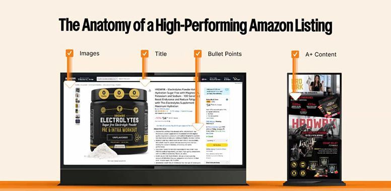
A lot of Amazon sellers think conversion is about one magic fix. A better main image. A stronger title. More reviews. A lower price. Better PPC. Those things matter. But a high-converting Amazon listing is rarely built on one improvement alone. It is built on structure. That is what many brands miss. When a listing converts well, it usually is not because one element is exceptional. It is because the entire page works together to move the shopper from interest to confidence to purchase. That is the anatomy of a high-converting Amazon listing. It is not just about getting attention. It is about removing doubt. Conversion Starts Before the Click Most people think conversion begins on the product page. In reality, it starts earlier. A shopper sees your product in search results and makes a split-second decision: Is this worth clicking? That means your listing is already being judged before anyone reads your bullets or views your A+ Content. At that stage, a few things do the heavy lifting: Main image Title Price Ratings and review count Offers, badges, or visible product cues If those elements do not create enough interest or trust, the customer never makes it to the rest of your page. A high-converting listing understands this. It does not treat the click as guaranteed. It earns it. 1. The Main Image Does the First Job Your main image is not just a compliance requirement. It is one of the biggest conversion drivers on the page. A strong main image should do three things fast: Create clarity Look professional Help the product stand out If the image looks dark, cluttered, oddly cropped, or visually weak beside competitors, your click-through rate suffers before conversion even has a chance. The main image should feel clean and confident. It should make the shopper think, “This looks like a serious product.” That first impression matters more than many sellers realize. 2. The Title Balances Search and Readability A high-converting title does two jobs at once. It helps Amazon understand what the product is, and it helps the customer understand why it matters. Weak titles often fail in one of two ways: They are too vague They are overloaded with keywords and hard to read A strong Amazon title should feel clear, relevant, and intentional. It should include important search terms, but it should still read like something written for a human. Because ranking gets the visibility. But readability helps win the sale. 3. The Images Continue the Selling Process Once the shopper clicks, the secondary images take over. This is where a lot of listings lose momentum. Some brands use this space to repeat obvious things or fill it with generic graphics. High-converting listings use images strategically. They answer the shopper’s next questions: What does this product do? What makes it different? How is it used? What is included? Why should I trust it? The best image stacks are not random. They are sequenced. They guide the shopper through a decision. One image may highlight the main benefit. Another may show scale or dimensions. Another may explain features. Another may add lifestyle context. Another may reduce uncertainty. That flow matters. Good images do not just decorate the page. They move the sale forward. 4. The Bullet Points Turn Features Into Value One of the biggest mistakes sellers make is writing bullets that only describe the product. A high-converting listing goes further. It connects product features to customer value. Instead of only saying what the product has, it helps the shopper understand why that matters. For example: A weak bullet talks about material. A stronger bullet explains what that material helps the customer do. A weak bullet mentions size. A stronger bullet explains how the size improves usability, storage, fit, or convenience. This is an important distinction because shoppers are not just buying features. They are buying outcomes, ease, confidence, and reassurance. The bullet points should help bridge that gap. 5. A+ Content Builds Confidence A+ Content does not usually rescue a weak listing. But it can absolutely strengthen a good one. Its job is not to repeat everything already said. Its job is to build confidence. That can happen through: Cleaner brand presentation Stronger product education Comparison charts Reinforcement of key differentiators Better visual storytelling When used well, A+ Content makes the listing feel more complete and more professional. It tells the shopper there is a real brand behind the product. And that matters, especially in competitive categories where many products look similar. 6. The Listing Reduces Friction This is one of the most overlooked parts of conversion. High-converting listings make the buying decision easier. They reduce friction. That means the shopper does not have to work too hard to understand the product, imagine the use case, compare options, or find reassurance. Low-converting listings often create unnecessary hesitation. The information is incomplete. The visuals feel disconnected. The copy is too generic. The questions are unanswered. The value is unclear. Every small uncertainty creates drag. And enough drag lowers conversion. A strong listing removes as many of those points of hesitation as possible. 7. Trust Is Built Through Details Amazon shoppers are fast, but they are also skeptical. They notice details. They notice when the brand presentation feels polished. They notice when the copy sounds generic. They notice when the images look outdated. They notice when the page feels incomplete. Trust is not built by one bold claim. It is built through many small signals. Some of those signals include: Consistent branding Clear copy Professional images Helpful product information Clean formatting A complete page experience When those details are handled well, the listing feels safer to buy from. That feeling matters. 8. Conversion Is About Alignment A high-converting listing is aligned. The title sets the expectation. The main image supports it. The secondary images expand on it. The bullet points reinforce it. The A+ Content deepens it. Everything points in the same direction. That alignment creates momentum. When listings underperform, it is often because their elements are technically present but strategically disconnected. The images say one thing. The bullets say another. The design feels unrelated to the positioning. The page exists, but it does not persuade. That is the difference between a complete listing and a converting listing. What High-Converting Listings Usually Have in Common Most strong Amazon listings share a few traits: A clear and compelling main image A readable, keyword-aware title Secondary images that answer real shopper questions Bullet points focused on value, not just features A+ Content that builds confidence Consistent branding across the page Clear positioning Less friction and less doubt None of these elements alone guarantee high conversion. But when they work together, the page becomes easier to trust and easier to buy from. Final Thought A high-converting Amazon listing is not just well-designed. It is well-structured. Every part of the page should help the shopper move one step closer to purchase with less confusion and more confidence. If your traffic is there but conversions are not, the issue may not be visibility alone. It may be the structure of the listing itself. That is where CMO can help. We help brands turn underperforming product pages into stronger, more strategic Amazon listings built to convert.
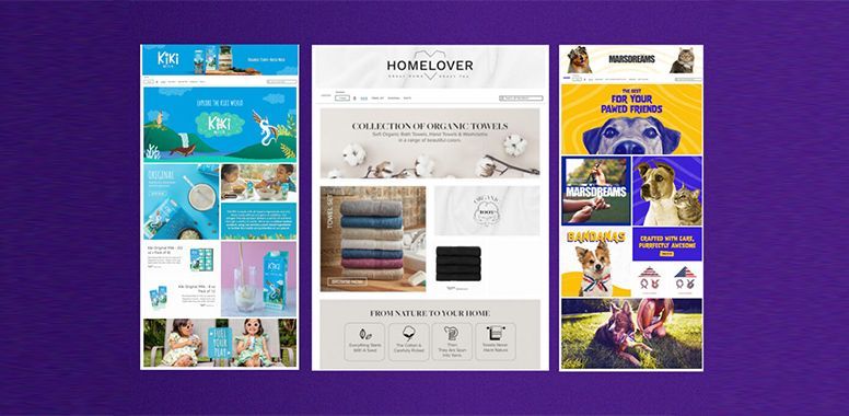
Scroll through Amazon long enough and you notice something interesting: Some brands just feel bigger . They look more established, more trusted, and more polished. Even before you know their sales numbers, you assume they are doing well. And sometimes, they are. But sometimes, they are not nearly as big as they appear. That is what many sellers miss. On Amazon, size is not communicated by revenue alone. A brand can be small behind the scenes and still look credible, intentional, and highly professional in front of the customer. Another brand can have a solid product and real potential, yet still look inconsistent, generic, and forgettable. In other words, shoppers do not always buy from the biggest brand. They often buy from the brand that looks like it knows what it is doing. That difference matters more than most sellers realize. Perception Is Part of the Conversion Amazon is a fast environment. People do not study your listing the way they might browse a luxury brand website. They scan, compare, and judge quickly. Within seconds, shoppers are asking silent questions: Does this brand look legitimate? Does this product feel worth the price? Do I trust this enough to buy today? Does this look better than the other options on the page? Those questions are not answered by one thing alone. They are answered by the full experience your brand creates. This is why some Amazon brands appear larger than they really are. They understand that scale is not only operational. It is also visual, emotional, and strategic. The brands that look bigger know how to send the right signals consistently. 1. They Create Consistency Across Every Touchpoint One of the clearest differences between a brand that looks established and one that looks small is consistency. Not perfection. Consistency. The hero image looks clean and confident. The secondary images feel like they belong to the same brand. The title is readable. The bullets are structured. The A+ Content matches the tone of the listing. The storefront does not feel abandoned. When those pieces line up, the brand feels more professional and more reliable. Customers may never consciously say, “This brand is visually consistent.” But they feel it. And that feeling becomes trust. A lot of smaller brands underestimate how powerful this is. They assume shoppers only care about price, reviews, and features. Those things matter, yes. But when several products seem similar, the customer often leans toward the option that feels more complete. That sense of completeness is what makes a brand look bigger. 2. They Do Not Look Thrown Together Some Amazon listings feel like they were built one piece at a time by different people with different goals. For example: The main image says one thing The title says another The bullets feel generic The graphics look outdated The A+ Content is weak or disconnected The storefront looks untouched That kind of listing does not just feel unfinished. It feels risky. Customers may not say it out loud, but the impression is there. If a brand looks careless in presentation, shoppers start wondering whether it may also be careless in quality, service, or support. Brands that look bigger avoid that problem. Their presence feels cohesive, intentional, and maintained. Even when they are not large companies, they project the discipline of one. 3. They Communicate Premium Without Saying It A lot of sellers try to look premium by simply calling themselves premium. That rarely works. Real premium perception comes from presentation. A stronger-looking brand usually has cleaner design, sharper copy, better image flow, and clearer value communication. It does not overload the shopper. It does not look desperate. It does not try too hard. Instead, it feels controlled. That control is powerful because it signals confidence. It tells the shopper, “We know what we are selling, who it is for, and why it matters.” Brands that look bigger are often the ones that communicate value clearly without clutter. 4. They Sell a Brand Experience, Not Just a Product Small brands often stay stuck because they treat each product like a separate task instead of part of a bigger brand system. Bigger-looking brands do something different. Even when a shopper lands on one product page, the brand still comes through. There is a recognizable tone. A recognizable design style. A sense that there is a real business behind the product, not just a listing. That matters because customers do not only buy products. They buy reassurance. They want to feel like the brand behind the purchase is credible and worth trusting. When a listing feels connected to a stronger brand experience, it creates that reassurance. Every touchpoint should reinforce the same message: We are real, intentional, and professional. That is what larger-looking brands communicate well. 5. They Make the Buying Decision Easier Brands that look bigger tend to reduce friction. Their images answer questions faster. Their copy highlights value quickly. Their A+ Content builds confidence instead of repeating filler. Their storefront helps shoppers explore without confusion. This matters because many sellers think “looking bigger” is mostly about design. It is not. It is operational clarity translated into customer-facing content. A big-feeling brand usually makes shopping easier. That ease feels professional. And professionalism feels established. Confusing listings feel small. Clear listings feel credible. 6. They Influence Price Perception Have you ever seen two similar products where one looked more valuable before you even compared the details? That is not accidental. Presentation changes how price is interpreted. A weak listing can make even a fair price feel too high A strong listing can make a higher price feel justified This is one reason smaller brands can outperform larger competitors. They are not always competing by being cheaper. They are competing by looking more trustworthy, more refined, and more thought through. When that happens, the customer stops asking only, “What costs less?” They start asking, “Which one feels like the better choice?” That is where stronger conversion and better margins begin. What Makes a Brand Look Bigger on Amazon It is rarely one dramatic thing. It is a stack of signals working together. Some of the strongest signals include: A polished main image Strong secondary images Clear, strategic copy A readable, search-friendly title Bullet points that communicate value fast A+ Content that builds confidence A storefront that feels active and branded Catalog consistency across products Positioning that feels specific instead of random None of these elements alone guarantee success. But together, they create the impression of a serious brand. And on Amazon, serious brands often earn more trust faster. The Good News for Smaller Brands You do not need to be a massive company to look like one. You do not need a huge team, a massive budget, or hundreds of SKUs. What you need is alignment: Alignment between your visuals and your copy Alignment between your product promise and your positioning Alignment between your listing and the shopper you want to reach This is where many brands gain an edge. Not by pretending to be something they are not, but by presenting themselves with more clarity, consistency, and confidence. Amazon is crowded, but it is also full of listings that are only half-built. That means brands willing to be more intentional still stand out. Final Thought If your brand is getting clicks but not winning trust, the problem may not be your product. It may be the way your brand shows up on Amazon. That is where CMO can help. We help brands turn underperforming listings into stronger, more polished Amazon assets that look credible, convert better, and support long-term growth.

The Amazon landscape in 2026 is flooded. As AI-powered tools become the standard for generating product listings, the marketplace is seeing a surge of "perfect" but hollow content. Competitors are using machine learning to churn out technically accurate bullet points and SEO-stuffed descriptions at scale. However, there is a flaw in the machine: AI excels at "Specs," but it struggles with "Soul." To outrank your competitors and stay ahead, you must pivot from simply listing features to mastering the art of emotional storytelling. The "Sea of Sameness" Problem When every competitor uses the same AI prompts, their listings begin to look identical. They all highlight the same keywords and technical data. For a shopper, this creates "feature fatigue". Specs are logic-based: They appeal to the rational brain but rarely trigger a purchase. Storytelling is emotion-based: It builds a connection and assures shoppers that a product will meet their specific, human needs. 1. Moving from Features to Benefits The most common mistake in Amazon SEO is focusing strictly on what a product is rather than what it does for the buyer. The Spec (AI Style): "1000 Thread Count Egyptian Cotton Sheets." The Story (CEO Style): "The Sunday morning sleep-in you’ve been waiting for. Experience the crisp, five-star hotel feel that turns your bedroom into a sanctuary." By using natural language and phrasing that aligns with how humans actually think and speak, you not only improve conversion but also optimize for voice search queries. 2. Leveraging Visual Storytelling Your images must tell the story that your copy starts. While AI can generate a clean product photo, it often fails to capture the "vibe" of a brand. Lifestyle Shots: These are essential for building a connection. Showing a product in real-life situations—like a cozy bathrobe in a luxurious bathroom—appeals to emotional purchasing triggers like comfort and relaxation. A+ Content: This is your platform for brand storytelling. Use rich media and comparison charts to highlight your Unique Selling Propositions (USPs) in a way that goes beyond traditional, dry descriptions. 3. Building Trust Through Human Connection In 2026, trust is the ultimate currency. Shoppers are becoming wary of overly "perfect" AI-generated reviews and images. Social Proof: High ratings and positive reviews act as indicators of quality that AI copy cannot fake. Addressing Concerns: Professionally responding to negative reviews shows there is a human behind the brand who cares about the customer experience. This proactive management enhances buyer trust more than a list of technical specs ever could. 4. The 2026 Competitive Edge: The "Human-in-the-Loop" While we embrace AI for predictive insights and efficiency, the brands that "win" are those that use AI as a foundation, not a finish line. Refine your SEO strategy: Use tools like Helium 10 to find the data, but use your brand voice to deliver it. Highlight Key Features: Use bullet points to answer potential buyer questions and address specific pain points that an AI might miss. Conclusion: Facts Tell, Stories Sell Mastering Amazon SEO in 2026 is an ongoing process of adaptability. While your competitors are busy "optimizing for the bot," the most successful brands are optimizing for the human. An image may be worth a thousand words, but a story is worth thousands in sales. Stop listing specs and start starting conversations. Ready to inject some soul into your Amazon listings? Book your strategy session with CMO today!

In the 2026 Amazon marketplace, the "blink of an eye" has become the ultimate conversion metric. As an Amazon Service agency CEO, I’ve watched the traditional buyer’s journey transform from a deliberate search into a high-speed, AI-curated experience. We are no longer just competing with other brands; we are competing with the split-second processing power of "AI-assisted" mobile shoppers. This is the 3-Second Rule: If your visual assets haven't established trust, conveyed utility, and answered a shopper's primary "Why" within three seconds, you’ve already lost the sale. 1. The New Mobile Reality: Speed and AI Selection By 2026, mobile shopping isn't just a preference; it’s the dominant force. However, the modern mobile shopper isn't scrolling alone. They are increasingly assisted by AI tools like Rufus, which pre-sorts and summarizes product data before a human even sees it. When a shopper finally lands on your listing, they are looking for immediate visual confirmation of what the AI promised. This means your visuals must be: Glanceable: Mobile users tend to skim rather than read. Fast-Loading: Images must be high-quality yet compressed for lightning-fast delivery on 5G networks. Thumb-Stopping: The main image must occupy at least 85% of the frame on a pure white background to pop on smaller screens. 2. Visual Storytelling as a Trust Multiplier In a marketplace saturated with AI-generated content, authenticity is your brand’s greatest moat. Shoppers make snap judgments about your professionalism based on your imagery. If your photos look "cheap" or generic, the AI-assisted shopper—who is conditioned to expect premium, relevant results—will bounce instantly. To build trust in under three seconds, your "Image Stack" must do the heavy lifting: Clarity and Detail: Use high-resolution shots (at least 1000 pixels on the longest side) to enable zoom functionality. Lifestyle Integration: Don't just show the product; show it in a real-world scenario. This builds an emotional connection that "specs" alone cannot achieve. Consistency: Your visual style must be cohesive across all seven available image slots. Inconsistency signals a lack of brand maturity. 3. Highlighting Features for "AI-Ready" Listings Amazon’s A9 algorithm—increasingly powered by machine learning—now "reads" your images to determine relevance. To outrank competitors, your visuals must explicitly highlight what makes your product the superior choice. The Power of A+ Content: Utilize rich media, comparison charts, and video to provide a "deep dive" for shoppers who move past the initial 3-second hook. Studies show A+ content can boost conversions by up to 10%. Feature Emphasis: Use infographics to call out unique textures, dimensions, or technical specifications that might be buried in the text. Reducing Friction: Clear visuals answer questions before they are asked, reducing the hesitation that leads to cart abandonment. 4. Avoiding the 2026 "Visual Death Traps" Even the best SEO strategy can be sabotaged by common visual mistakes. In 2026, these errors are more costly than ever: Clutter: Overloading images with unnecessary text or logos overwhelms mobile shoppers. Mobile Cropping: Keep crucial details away from the edges of the frame to ensure they aren't cut off on various smartphone aspect ratios. Genericism: If your images look like everyone else's, you become a commodity. Use lifestyle shots to highlight your Unique Selling Proposition (USP). 5. Conclusion: The Image is the New Keyword As we move deeper into 2026, the lines between "Search Optimization" and "Visual Conversion" are blurring. Your images aren't just there to look pretty; they are functional data points for both the Amazon algorithm and the human eye. By mastering the 3-Second Rule, you ensure that your brand isn't just "found"—it’s chosen . In the world of AI-assisted mobile shopping, the right image isn't just worth a thousand words; it’s worth thousands in sales. Is your brand ready to dominate the visual landscape of 2026? Don't let poor imagery hold your rankings back. It's time to treat your visual stack with the same strategic rigor as your PPC campaigns. Ready to elevate your product images and boost conversions? Book your strategy session with CMO today!
Currently, thousands of Amazon sellers are waking up to slimmer profit margins after Amazon rolled out 11 major FBA structural changes in the first quarter alone. The headline number everyone is talking about is the average $0.08 per-unit fulfillment fee increase that took effect recently. But that’s just the tip of the iceberg. Amazon eliminated FBA prep and labeling services, introduced new defect penalties that jumped as high as 1,600% in some cases, shifted low-inventory fees to the SKU level, updated the Agent Policy on March 4, changed return-label requirements for seller-fulfilled orders, stopped sharing reviews across certain variations, and more. These aren’t small tweaks — they’re a complete reset of how FBA works. Sellers who treat this as “just another fee hike” will bleed margin. Those who treat it as a strategic reset will actually gain competitive advantage in the second half of 2026. This guide breaks down every change with real numbers and gives you a simple 5-step plan you can execute. The 11 Changes That Matter Most Right Now Fulfillment Fee Increases Standard-size products priced $10–$50 now cost an average $0.08 more per unit . Small standard-size items in that range saw +$0.25 , while large standard-size items only rose +$0.05 . Products under $10 got a smaller bump but still lost some of their previous discount. Multi-Channel Fulfillment and Buy-with-Prime fees also rose (average +$0.24–$0.30). Amazon claims this is still below inflation and carrier increases, but for high-volume sellers moving 5,000+ units/month, that’s an extra $400–$1,250 in monthly costs with zero warning. FBA Prep & Labeling Services Officially Ended Amazon no longer offers prep or labeling in the US. Sellers must now handle polybagging, bubble wrap, labeling, cartonization, and pallet standards themselves — or pay a third-party prep service. Non-compliant shipments face delays, rejection, or new inbound placement fees. Low-Inventory Fees Now Charged at SKU/FNSKU Level Previously calculated at the parent ASIN level. Now each variation can trigger fees independently if stock drops too low. This punishes sellers with slow-moving color/size variants. Inbound Placement Service Fees Increased Average +$0.05 per unit, with more pricing tiers based on how “complex” your shipment is (size, weight, destination). New Defect & Inbound Compliance Penalties Some categories saw defect fees jump 1,600%. Amazon now has near-zero tolerance for mislabeled or poorly packed cartons. Agent Policy Update Every automated tool connecting to Seller Central must now self-identify as an “automated system.” Non-compliant tools risk account suspension. Payout Timing Pushed Back One Week Many sellers noticed cash flow delayed by 7 full days. Review Sharing Across Variations Tightened Reviews will no longer automatically share across child ASINs that differ in functionality, formulation, or intended use. This hurts listings with many color/size variants. Prepaid Return Labels Required for All Seller-Fulfilled Orders No more exemptions — every US seller-fulfilled order must use Amazon’s prepaid return label program. Inventory Over 12 Months Old Faces Extra Fees Long-term storage fees are now stricter. No New Fee Types — But More Granular Tiers Amazon is adding pricing tiers instead of brand-new fees, which rewards efficient packaging and planning but punishes inefficient ones. Your 5-Step Survival Plan You Can Start Today Step 1: Run a Full Margin Audit This Week Open Seller Central → Reports → Business Reports → Fee Preview Tool and the new Revenue Calculator (now available earlier than ever). Export the last 30 days of orders and recalculate every ASIN with the new fees. Flag any product where the new FBA cost pushes your margin below 25%. Most sellers discover 15–30% of their catalog is now unprofitable or barely breaking even. Use the free tools Amazon released in Q1 to model packaging changes before you reorder. Step 2: Lock in Third-Party Prep Partners Immediately Since Amazon prep is gone, vetted prep centers (or in-house setup) are now mandatory. Contact 2–3 reputable prep services this week and run a test shipment of 100 units. Negotiate volume rates now before summer rush. Top performers are moving to hybrid models: FBA for top 20% of SKUs, FBM or 3PL for the rest. This alone can save $0.15–$0.40 per unit versus new FBA rates. Step 3: Re-Optimize Packaging & Size Tiers The new fee structure heavily rewards “small standard” size. Switch to lighter, smaller boxes and polybags wherever possible. Eliminate oversized cartons that trigger higher inbound placement fees. Test bundling slow-moving variants into multi-packs to reduce low-inventory fee exposure. Sellers who redesigned packaging in February/March are already reporting 8–12% lower effective fulfillment costs. Step 4: Restructure PPC & Pricing to Offset Fee Pressure With higher FBA costs, your break-even ACoS just dropped. Shift budget to exact-match and phrase-match campaigns on your most profitable SKUs. Use the new persona-targeting options in Amazon Marketing Cloud (AMC) to reach high-intent buyers instead of broad keywords. Raise prices 3–7% on items that absorbed the full $0.08–$0.25 hit — data shows most buyers accept small increases if reviews and images stay strong. Run Lightning Deals or coupons only on SKUs that still clear 30%+ margin after new fees. Step 5: Build a Q2/Q3 Inventory & Cash-Flow Buffer The Big Spring Sale just ended, but Mother’s Day, Memorial Day, and Prime Day prep are next. Aim to have 60–75 days of forward cover on best-sellers by mid-April. Use the new Profit Analytics dashboard to forecast exact cash needed after the delayed payout schedule. Consider moving 10–20% of slow movers to FBM or Amazon MCF to avoid long-term storage fees. Real Numbers from Sellers Who Acted Early One mid-six-figure seller I spoke with in late March ran the audit and discovered their effective FBA cost rose 9.4% overall. By switching two SKUs to smaller polybags and raising price $1.49 on a third, they recovered 6.8% of margin within 14 days. Another brand that moved prep in-house saved $0.31 per unit and eliminated inbound rejection fees entirely. The Bottom Line for April 2026 Onward Amazon’s 2026 changes are not going away — but they are predictable. The sellers who win are the ones treating this as a packaging, pricing, and process reset instead of complaining about fees. Those who act in the next 30 days will enter Prime Day and Q4 with stronger margins and cleaner operations than 80% of their competition. Start with the margin audit today. Download your fee preview report, tag every ASIN that lost money under the new structure, and schedule your first prep-partner call this week. The window to adjust before summer inventory deadlines is closing fast. If you want my exact 2026 FBA Fee Impact Calculator spreadsheet (with the new tier tables already built in) or a ready-to-use packaging redesign checklist, just reply with “SEND TOOLS” and I’ll share them. The game changed in January. The winners are already adapting in April. What’s your biggest FBA fee impact right now — prep costs, low-inventory charges, or the straight per-unit increase? Drop it in the comments and I’ll help you prioritize your next move. Conclusion Amazon’s 2026 FBA changes are permanent and will continue squeezing margins for sellers who ignore them. The winners this year won’t be the ones complaining about higher fees — they’ll be the ones who quickly adapt their packaging, pricing, prep, and inventory strategy. Start your margin audit this week, lock in prep partners, and execute the 5-step plan before the busy season hits. Those who act now will enter Prime Day and Q4 with stronger profits and a real competitive advantage. Boost overall efficiency in achieving your company's strategic goals. For brand management, reach out here or book a zoom call today. Let’s find out how CMO can drive your success!
Another major evolution is the rising importance of ad creative. In 2026, Amazon expanded video and enhanced image support across more Sponsored Products placements, including homepage and detail-page ads. Data from top-performing accounts shows that listings with strong video creatives in PPC are seeing click-through rates improve by 30-50% compared to static images alone. High-quality creatives don’t just attract clicks — they improve relevance scores in Amazon’s AI engine. A well-shot lifestyle video demonstrating your product (for example, a quick demo of isolation tweezers creating perfect lash fans) signals to the algorithm that your ad matches buyer expectations. This leads to better placement at lower costs over time. Smart sellers are now treating PPC creative as seriously as their main listing images. Testing multiple video variations, using clear text overlays, and showing real customer benefits have become standard practice for scaling campaigns profitably. The New Campaign Architecture That Actually Works Successful PPC structures in 2026 look very different from the old “auto + broad + exact” setup. Here’s the framework top sellers are using right now: Discovery Campaigns : Run auto or broad match with modest budgets to harvest fresh search terms and persona signals. These feed data into your more targeted campaigns. Defense & Brand Campaigns : Protect your own branded terms and ASINs with lower bids to maintain control and defend against competitors. Conquer & Expansion Campaigns : Target competitor ASINs, related categories, and high-intent persona segments to steal market share. Creative & Video Campaigns : Dedicated budgets for video-heavy ads to boost engagement and lower overall ACoS through better quality scores. Layering these with negative keywords harvested weekly keeps waste low. Many sellers also use automation rules to adjust bids based on ACoS targets, conversion rate thresholds, and inventory levels. The goal is no longer maximum impressions — it’s profitable, sustainable growth with controlled TACoS (Total Advertising Cost of Sales). Practical Steps to Rebuild Your PPC for 2026 If your current campaigns feel stuck, follow this 5-step reset you can start this week: Audit Your Existing Structure Pull search term reports for the last 30-60 days. Identify top-performing keywords and personas, then pause or negate anything with ACoS above your target margin. Most sellers discover 30-40% of their spend is going to low-value traffic. Build Persona Portfolios in AMC Use Amazon Marketing Cloud to create audience segments based on past purchasers, category browsers, and lifestyle signals. Test these in Sponsored Display and Sponsored Products for faster efficiency gains. Upgrade Your Creatives Create at least 3-5 video variations per hero product. Focus on clear benefits, real usage, and strong calls-to-action. Test them in rotation and keep winners. Shift Budget Toward Profitability Move more spend to exact and phrase match on proven terms while using auto campaigns only for discovery. Raise prices slightly on high-margin items if needed to absorb rising CPCs — small increases are often accepted when supported by strong listings. Monitor and Automate Weekly Set rules for bid adjustments, budget pacing, and pausing underperformers. Track TACoS alongside ACoS to ensure paid sales are truly contributing to long-term organic growth. Sellers who implemented this type of reset in Q1 2026 are already seeing ACoS improvements of 10-20% while maintaining or increasing sales volume. Real Results from Sellers Adapting Now One mid-sized beauty brand selling lash tools reported that after switching to persona + video-focused campaigns in February, their overall PPC ACoS dropped from 42% to 31% within six weeks. Another supplement seller using multi-collagen capsules moved 25% of budget into AMC persona targeting and recovered an extra $8,000 in monthly profit by reducing wasted clicks. These aren’t isolated cases. Across categories like beauty tools, supplements, photography accessories, and apparel, the pattern is clear: brands embracing the new intent-driven PPC model are pulling ahead. Final Takeaway Amazon PPC in 2026 is no longer about who bids the highest on popular keywords. It’s about who best understands their buyer, delivers compelling creative, and builds intelligent campaign structures that align with Amazon’s AI signals. The transition feels challenging at first, but it rewards sellers who focus on quality over quantity. Those who invest time now in auditing, testing creatives, and building persona strategies will enjoy lower costs, higher conversions, and stronger organic rankings as paid velocity feeds the A10 algorithm. Don’t wait for your competitors to figure it out. Audit one campaign this week, create your first video ad, and test a simple persona segment. The sellers winning in 2026 aren’t necessarily spending more on ads — they’re simply spending smarter. Start rebuilding today. The PPC landscape has changed, and the opportunity belongs to those who adapt fastest. What’s your biggest PPC struggle right now — rising costs, low conversions, or campaign structure? Reach out here or book a zoom call today. We’ll help you prioritize your next optimization move.


