The Listing Obsession Problem: Why Brands Overthink Bullets and Ignore Images
INTRODUCTION — THE HIDDEN PROBLEM MOST BRANDS NEVER NOTICE
Every brand reaches a point in their Amazon journey when they feel stuck.
The listing is live. Ads are running. Traffic is coming in. But conversions? Not enough.
So the team gathers.
Everyone crowds around the listing.
And where does the attention go?
The bullets.
Someone says the bullets need “more emotion.”
Another wants to squeeze in more keywords.
Someone else thinks the bullets are “too long.”
Then someone asks if adding a trademark symbol somewhere will help.
Before you know it, the team is rewriting, rearranging, rephrasing, and re-optimizing the bullets like their lives depend on it.
And the images?
Still the same ones from two years ago.
This is the Listing Obsession Problem — the invisible trap where brands fixate on copy while ignoring the biggest conversion lever they have:
The image stack.
This blog is a full, deep, raw examination of why this happens, how it hurts your business, and how fixing it transforms your entire Amazon funnel.
This isn’t surface-level optimization advice.
It’s a breakdown of the psychological, structural, and strategic blind spots holding back thousands of Amazon brands — including ones that spend millions.
Let’s dive in.
CHAPTER 1 — WHAT BRANDS THINK MATTERS VS. WHAT SHOPPERS ACTUALLY SEE
It doesn’t matter how much time a brand invests in perfecting its listing if that listing doesn’t match real customer behavior. And the truth is:
Brands think customers read.
Customers actually scroll.
Brands imagine a buyer sitting comfortably with coffee, reading each bullet carefully and comparing it to competitors like a college professor grading papers.
But the real Amazon shopper?
They are:
Standing in line at the grocery store
Rushing between meetings
Quickly browsing before bed
Comparing products in seconds
Making snap judgments
Shopping on mobile 70%+ of the time
Amazon shopping is fast, reactive, visual.
Buyers don’t “study” listings — they scan them.
What do they scan first?
Images. Always images.
Even when they think they’re reading, they’re visually scanning.
Amazon has designed the mobile experience so that images dominate the screen. Bullets are collapsed. Descriptions are buried. Titles get cut off.
The shopper is guided — by the platform — to make decisions based on visuals.
This is not speculation.
It’s the foundation of conversion psychology on Amazon.
Yet brands are still operating as if Amazon is a text-heavy retail site.
This creates a massive disconnect:
Brands optimize for reading.
Buyers optimize for speed.
And that mismatch is often the single biggest reason a listing underperforms.
CHAPTER 2 — WHY BRANDS DEFAULT TO REWRITING BULLETS
If images matter more, why do brands still obsess over bullets?
Because rewriting bullets
feels
productive.
It feels like optimization.
It feels like you’re fixing the listing.
But psychology — not strategy — drives this habit.
1. Copy feels easier to fix than visuals
Rewriting a sentence takes 30 seconds.
Redoing an image requires:
Design
Cohesion
Layout decisions
Branding alignment
Possibly photography
Team approvals
So brands take the path of least resistance.
2. Leaders “read” the listing — so they prioritize what they see
Executives, managers, and internal teams read the bullets because THEY are deeply invested.
But buyers?
They aren’t.
This creates a mirror bias.
Leaders judge their own listing like power users , not real shoppers.
3. Many agencies are copy-heavy, not visual-first
Bad agencies hide weak design behind “bullet tweaking.”
Good agencies know:
images sell, bullets support.
4. Brands misinterpret SEO
They think SEO lives inside bullet points.
But Amazon’s algorithm reads:
Titles
Image alt text
A+ content
Backend keywords
Reviews
Q&A
Bullets (with less weight than before)
Bullets help, but they are not the SEO holy grail.
5. Copy feels safer than creative risk-taking
Changing images requires choices.
Choices feel risky.
Copy feels neutral and safe.
So brands cling to it.
CHAPTER 3 — THE REAL COST OF OVERVALUING BULLETS
Obsessing over bullets seems harmless, but the costs are real. And they compound.
Cost 1: Lower conversion rate
A shopper makes their buy/no-buy decision before they ever read your bullets.
If your images aren’t selling the product, the shopper will never scroll down to see your beautifully optimized text.
That means you’re optimizing the wrong part of the funnel.
Cost 2: Higher PPC spend
Weak images = weak engagement.
Weak engagement = higher CPC.
Higher CPC = higher TACoS.
Higher TACoS = smaller margins.
Amazon rewards listings that convert.
Images drive conversion.
Cost 3: Lost mobile traffic
Mobile users don’t read bullets unless they’re highly motivated — and most aren’t.
If images don’t convince them, the rest of the listing goes unseen.
Cost 4: Slower ranking
Amazon’s organic ranking system heavily favors:
High CVR
Strong relevancy
Better retention
Better images improve these automatically.
Cost 5: Endless frustration
When you optimize bullets but ignore images, the listing feels “stuck.”
You keep tweaking — but nothing moves.
Because you’re fixing the wrong problem.
CHAPTER 4 — WHAT IMAGES DO THAT BULLETS NEVER CAN
Images sell emotion.
Bullets sell logic.
And emotion beats logic every single time — especially on Amazon.
Here’s what images accomplish in 2 seconds that bullets would take 400 words to explain:
Show the product’s purpose
Communicate quality
Demonstrate ease of use
Solve objections
Visualize benefits
Build trust
Position the brand
Clarify what’s included
People buy emotionally and justify logically .
Images create the emotional spark.
Bullets provide the justification — if the shopper gets that far.
CHAPTER 5 — HOW A SHOPPER ACTUALLY MOVES THROUGH YOUR LISTING
Let’s break down the real buyer journey:
STEP 1 — They see your main image
If it doesn’t stand out…
If it doesn’t communicate quality…
If it doesn’t pop against competitors…
They never click.
STEP 2 — They skim your secondary images
Within 3–5 images, they decide:
Do I understand this product?
Does it solve my problem?
Is it better than alternatives?
Does it feel trustworthy?
If the answer is no → they leave.
STEP 3 — They look at reviews
They want to know if other people trust your product.
STEP 4 — They scroll back up to images
They re-evaluate visually.
STEP 5 — Only then might they scan bullets
Bullets are confirmation, not persuasion.
In other words:
Images close the sale. Bullets seal it.
CHAPTER 6 — THE 7-IMAGE STACK THAT DRIVES CONVERSION
This is the exact sequence CMO uses to increase conversion for clients consistently:
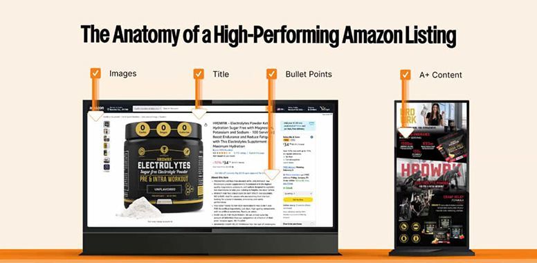
IMAGE 1 — High-impact main image
This determines click-through rate (CTR).
CTR influences impressions, ranking, ad costs, and total sales.
IMAGE 2 — “What it is” clarity image
Show the product clearly, cleanly, and confidently.
IMAGE 3 — Primary benefit
Highlight the #1 problem your product solves.
IMAGE 4 — Secondary benefit
Expand the emotional or practical value.
IMAGE 5 — How it works
Simple, clean, step-based demonstration.
IMAGE 6 — Social proof or trust elements
Badges, ratings, quotes, awards, or notable features.
IMAGE 7 — Lifestyle image
Show the product in the real world.
Context builds desire.
This sequence outperforms any bullet rewrite every time.
CHAPTER 7 — WHY BULLETS STILL MATTER (BUT NOT WHY YOU THINK)
Bullets reinforce.
Bullets clarify.
Bullets answer questions.
But they do NOT:
Drive conversions
Set first impressions
Capture attention
Build emotional connection
Bullets operate in the second half of the funnel.
Images own the first half.
A listing obsessed with bullets is optimized backward.
CHAPTER 8 — HOW TO BREAK THE LISTING OBSESSION PROBLEM
If you feel stuck in a cycle of rewriting bullets, here’s the fix:
STEP 1 — Stop rewriting bullets entirely
Accept that the bullets are not the conversion bottleneck.
STEP 2 — Audit the image stack ruthlessly
Ask:
Do my images sell the product?
Do they answer objections?
Do they highlight benefits visually?
Can a shopper understand everything in 5 seconds?
Do my images match my price point?
STEP 3 — Upgrade your images BEFORE your bullets
Images first.
Copy second.
Ads third.
STEP 4 — Rewrite bullets only after the image narrative is strong
This is when bullets make a real difference — supporting the visual story.
STEP 5 — Refresh A+ to align with your new image story
A+ is appearance, not SEO.
But appearance increases retention — and retention increases conversion.
STEP 6 — Scale PPC once conversion is improved
Ads are gasoline.
Your listing is the engine.
Gasoline doesn’t fix a broken engine.
CHAPTER 9 — REAL-WORLD EXAMPLE OF A BROKEN LISTING
A client comes with a common problem:
“We’ve rewritten the bullets four times.
Our agency said the bullets were weak.
We updated keywords.
We updated titles.
But conversion still won’t budge.”
Then we look at the images:
Weak main image
No lifestyle context
No benefit callouts
No trust signals
No “how it works” visuals
Inconsistent design
No clear value proposition
No differentiation from competitors
The problem isn’t the text.
The problem is the
visual journey.
The bullets are fine — the visuals are failing.
Fix the visuals → conversion jumps.
And that’s the moment brands finally understand:
Bullets don’t sell.
Images do.
CHAPTER 10 — THE FUTURE OF AMAZON BELONGS TO VISUAL-FIRST BRANDS
Amazon is shifting heavily toward visual commerce:
Larger mobile image displays
Expanded image carousel
Increased A+ importance
Video-first placements
Higher weight on main image CTR
More visual search behaviors
AI-driven recommendation systems with emphasis on image clarity
Brands that invest in visuals win.
Brands that fight over bullet phrasing get left behind.
Visual-first brands convert better, rank faster, and scale easier.
CHAPTER 11 — THE NEW OPTIMIZATION FRAMEWORK FOR 2025 AND BEYOND
Here is the correct order of operations for a high-performing listing:
- Main Image Optimization
- Image Stack Overhaul
- Title Optimization
- A+ Content Alignment
- Bullet Point Refinement
- Backend Keyword Completion
- PPC Scaling
Notice how bullets fall at step 5 — not step 1.
This is how modern listings are built.
CHAPTER 12 — FINAL TAKEAWAY: OPTIMIZE WHAT THE SHOPPER SEES, NOT WHAT YOU READ
If your listing isn’t performing, rewriting bullets won’t save it.
The solution is not:
A fancier sentence
A more descriptive phrase
A keyword rearrangement
“More emotion”
“More persuasion”
“More detail”
The solution is:
Fix what the shopper actually sees.
Not what you, the seller, read.
Fix the visual sales machine →
then reinforce it with clean, supportive copy.
When you structure your listing this way, Amazon becomes predictable.
You stop rewriting bullets weekly.
You stop blaming PPC.
You stop chasing keywords.
You stop feeling “stuck.”
You start converting.
You start ranking.
You start scaling.
This is how modern Amazon growth works.

William Fikhman is the founder of Chief Marketplace Officer (CMO), a fractional Amazon executive agency based in Los Angeles, California. He began selling on Amazon in 2009, scaling to $5M in year one and $20M+ within two years. Over 16 years, William has managed Amazon operations for more than 100 consumer brands, overseeing $300M+ in marketplace revenue across Seller Central and Vendor Central. He founded CMO to give consumer brands access to senior-level Amazon leadership on a fractional basis — without the cost of a full-time hire or the limitations of a traditional agency. William specializes in brand protection, distribution control, Amazon PPC strategy, and marketplace operations.
Connect on LinkedIn
|
Book a consultation
Recent Posts


