The First 3 Seconds Rule: How Shoppers Read Your Listing on Mobile
Most Amazon shoppers don’t “read” your listing.
They scan it—fast, on a small screen, with a thumb hovering over the back button.
On mobile, attention is ruthless. You get about three seconds to answer the shopper’s first two unconscious questions:
- Is this for me?
- Is this worth clicking into?
If the answer isn’t obvious immediately, they bounce. Not because your product is bad—because your listing didn’t surface the right meaning fast enough .
Welcome to the First 3 Seconds Rule: the mobile reality where clarity beats cleverness, and structure beats verbosity.
Why Mobile Changes Everything
Desktop shoppers browse like researchers.
Mobile shoppers browse like commuters. They’re:
- multitasking
- adding to carts quickly
- comparing options in seconds
- making snap judgments from visuals and micro-copy
Amazon knows this. That’s why mobile search results, image stacks, and bullets are built for speed. If your listing is built like a desktop brochure, mobile shoppers will feel friction before they even know why .
What Shoppers Actually See in the First 3 Seconds
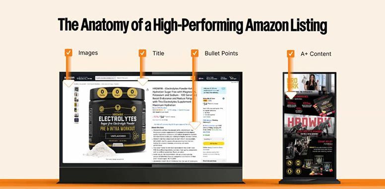
On a typical mobile detail page, shoppers see:
- Main image
- Title (truncated)
- Star rating + review count
- Price + coupon badge
- A small slice of the first bullet or two
- Variation thumbnails
That’s it.
No one is absorbing your full title.
No one is reading all five bullets.
No one is scrolling to your gorgeous A+ right away.
Mobile shoppers make a pre-decision here:
“This looks right / trustworthy / interesting enough to keep scrolling.”
Or
“Nope. Back.”
So your job isn’t to convince them in three seconds.
Your job is to earn
three more seconds.
The Mobile Scan Pattern (Thumb-Driven Psychology)
Here’s the real flow:
Step 1: Image verdict
Your main image is not “a photo.” It’s a
click trigger.
Shoppers scan for:
- category fit (what is it?)
- size/quantity clarity
- promise (what does it do?)
- visual trust (does it look legit?)
If your main image feels confusing or generic, you lose before copy starts.
Step 2: Trust check
Stars + review count are the fastest credibility signal on mobile.
A great listing with weak review framing feels risky.
Even if your rating is solid, you need to
support trust visually and verbally
:
- clean design
- clear claims
- no hype-y language
- consistent product story
Step 3: Identity match
Shoppers glance at the title to confirm:
- product type
- primary benefit
- who it’s for
Truncated titles that lead with fluff (“Premium Quality Ultra Advanced…”) delay meaning. Delay equals drop-off.
Step 4: Bullet skim
They don’t read bullets top to bottom.
They scan for
bold phrases, numbers, and quick relevance.
If Bullet #1 doesn’t land instantly, they may never reach Bullet #3.
How to Win the First 3 Seconds
1) Make your main image say something
Your hero image should answer:
- What is it?
- What problem does it solve?
- Why is it different?
You don’t need a billboard of text—but you do need meaning at a glance.
Mobile-ready main image cues:
- product shown large, centered
- packaging readable
- 1–3 short callouts max (if allowed in category)
- high contrast so it pops in tiny thumbnails
Think of your main image as your headline , not your decoration.
2) Front-load clarity in your title
On mobile, titles often truncate after 70–90 characters.
So the
first 45–60 characters are your real title.
Lead with identity + core benefit:
- Product type first (so they don’t guess)
- Differentiator second (so they don’t scroll away)
- Outcome third (so they feel value)
If the meaning isn’t obvious before truncation, you’re paying for words no one sees.
3) Bullet #1 is your mobile closer
Bullet #1 is not a “feature dump.”
It’s your first and best chance to lock relevance.
Use this order:
Intent → Benefit → Proof
Example rhythm:
- “For sensitive skin…”
- “gentle exfoliation without sting…”
- “low pH, fragrance-free, dermatologist tested.”
Mobile shoppers see a sliver—so every early word must earn its place.
4) Use numbers like landmarks
Numbers are scan magnets.
They turn vague benefits into fast proof.
Examples:
- “5% Niacinamide”
- “Up to 12 hours hydration”
- “60 capsules / 30-day supply”
- “2–3 uses per week”
These give mobile eyes something to grab .
5) Repeat the same story everywhere
Mobile conversion collapses when the listing feels inconsistent.
If your:
- image says “brightening”
- title says “anti-aging”
- bullets say “acne”
- A+ says “sensitive skin”
…shoppers feel uncertainty, and uncertainty kills fast decisions.
Pick your core intent set (usually 2–3) and echo them in:
- main image
- first 60 characters of title
- bullet #1 and #2
- first A+ module
Consistency = confidence.
The Big Mobile Mistake: Writing Like a Catalog
Many listings try to win with
more.
More synonyms, more adjectives, more claims.
But on mobile, more equals noise.
If a shopper has to
work
to understand you, they won’t.
Not because they’re lazy—because they’re shopping at thumb-speed.
Mobile winners use:
- fewer words
- sharper benefits
- cleaner formatting
- visual proof
- aligned messaging
They remove friction before it becomes doubt.
A Simple Mobile-First Test
Open your listing on your phone.
Then do this:
- Look for
three seconds
.
- Close your eyes.
- Ask yourself what you remember.
If you can’t confidently say:
- what it is
- who it’s for
- why it’s better
…your shopper can’t either.
That’s the whole game.
From Clicks to Conversions: Partner With Experts Who Master Amazon Psychology
At Chief Marketplace Officer, we don’t just write copy for desktop shoppers—we engineer listings for
mobile speed and human decision-making.
Our team of Amazon specialists:
- Creates clarity-first titles and bullets built for thumb-scroll behavior.
- Designs main images that communicate value in under three seconds.
- Aligns every module (images, copy, A+, ads) so shoppers feel instant confidence.
- Builds complete content ecosystems where relevance, trust, and conversion work together.
Amazon sellers don’t need guesswork—they need psychology-backed strategies that fuse creative precision with marketplace expertise. That’s where we come in.
Ready to Turn Browsers Into Buyers?
�55357;�56393;
Book Your Strategy Call with CMO Now
Final Thoughts
On mobile, attention isn’t earned by being louder.
It’s earned by being
clearer, faster, and easier to trust.
The First 3 Seconds Rule isn’t a trick—it’s a reality check.
Shoppers don’t owe you their time.
Your listing must
buy
it with instant relevance.
When your main image delivers meaning, your title front-loads clarity, and your first bullets answer real intent, you stop losing shoppers to the back button—and start winning the ones who were already looking for you.
Because on Amazon, the best listing isn’t the one that says the most.
It’s the one that gets understood the fastest.

William Fikhman is the founder of Chief Marketplace Officer (CMO), a fractional Amazon executive agency based in Los Angeles, California. He began selling on Amazon in 2009, scaling to $5M in year one and $20M+ within two years. Over 16 years, William has managed Amazon operations for more than 100 consumer brands, overseeing $300M+ in marketplace revenue across Seller Central and Vendor Central. He founded CMO to give consumer brands access to senior-level Amazon leadership on a fractional basis — without the cost of a full-time hire or the limitations of a traditional agency. William specializes in brand protection, distribution control, Amazon PPC strategy, and marketplace operations.
Connect on LinkedIn
|
Book a consultation
Recent Posts


