Color Theory for Amazon: How Design Can Boost Product Appeal

Author name

When it comes to standing out on Amazon, keywords and pricing may get buyers in the door—but it's design that closes the sale. Of all design elements, color is one of the most overlooked yet powerful tools in a seller’s toolkit. Strategic use of color can increase click-through rates, shape brand perception, and even influence buyer emotions and decision-making.


This post breaks down how color theory applies to Amazon listings, including your product images, packaging, A+ content, storefront, and even Sponsored Brand ads. You’ll learn how to use color to boost product appeal, improve brand recognition, and convert more shoppers into loyal customers.


Why Color Matters More Than You Think

Color isn’t just an aesthetic choice—it’s a psychological trigger. Studies show that color influences up to 85% of a buyer’s purchase decision. In a crowded digital shelf like Amazon, where shoppers scan dozens of products in seconds, color is often what grabs attention before any text is even read.

On Amazon, color affects:

  • Click-Through Rates: Hero images with appealing, high-contrast colors can outperform competitors by drawing more eyes.
  • Perceived Value: Certain hues (like gold, black, or navy) suggest luxury or professionalism. Others, like neon or pastel, suggest affordability or fun.
  • Trust: Consistent brand color palettes create a professional feel that builds credibility.
  • Emotions: Color can tap into emotional responses, from urgency (red) to calm (blue) or optimism (yellow).


Understanding the Basics of Color Theory

Before applying color strategy, it helps to understand a few key principles of color theory:

1. Primary Colors

Red, blue, and yellow—these form the foundation of all other colors.

2. Complementary Colors

These are opposite each other on the color wheel (e.g., blue and orange). Using them together creates contrast and energy.

3. Analogous Colors

These are next to each other on the color wheel (e.g., green, blue-green, and blue). They create harmony and cohesion.

4. Warm vs. Cool Tones

Warm tones (red, orange, yellow) create excitement and urgency. Cool tones (blue, green, purple) convey calm and professionalism.


Applying Color Theory to Amazon Listings

Let’s look at how you can apply this science to your Amazon assets.

📸 1. Main Product Image (Hero Image)

Your hero image is the first visual impression. While Amazon guidelines limit the use of graphic elements, color still plays a crucial role in:

  • The product color itself: Choose a best-selling or high-contrast color variation as the main image to stand out in search results.
  • Product background: It must be pure white (per Amazon TOS), but the color of the actual product should pop against it.
  • Packaging visibility: If your product includes colorful packaging, showcase it when allowed—it can enhance visual interest and perceived value.

💡 Tip: A red kitchen gadget pops more than a black one against white. If you offer multiple color variants, lead with the highest-click-through color option.


🖼️ 2. Secondary Images & Infographics

Here’s where you can start flexing your design muscles. Use color to:

  • Guide the eye: Use contrast to highlight key features or callouts.
  • Communicate benefits: Use color-coded sections or icons for easy scanning.
  • Align with brand palette: Use brand-approved colors consistently for polish and professionalism.

💡 Tip: Avoid using too many colors at once—limit to 2–3 complementary colors to keep visuals clean and digestible.


🧐 3. A+ Content & Storefront Design

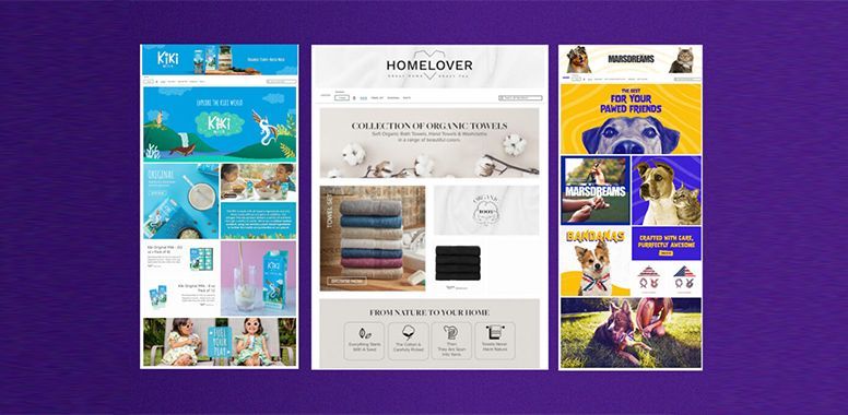
This is your chance to create a branded, immersive experience. Think beyond individual images—your A+ content and Amazon Store should tell a story using color as your emotional and visual anchor.

  • Use a consistent color palette that reflects your brand identity.
  • Use section backgrounds (light grays, soft brand tones) to break up visual monotony.
  • Apply color psychology:
  • Blue = trust, calm, expertise (great for skincare, tech, supplements)
  • Green = nature, balance, freshness (ideal for eco-friendly, wellness)
  • Red = urgency, excitement, energy (good for sports, tools, electronics)
  • Pink = warmth, nurturing, softness (common in beauty, baby, feminine brands)

💡 Tip: Consider creating a “Brand Style Guide” to ensure color usage stays consistent across all listings and ads.


🛙️ 4. Sponsored Brand Ads & Video

These are paid placements that appear above search results, and visuals matter more than ever. Bold, high-contrast color schemes stop scrolls and increase engagement.

  • Add colorful lifestyle images or graphic overlays with minimal copy.
  • Use call-to-action buttons with standout colors like orange or green (test both).
  • Ensure the ad design complements the color tone of your storefront for seamless transitions.

💡 Tip: Video ads with color-coded scene transitions or animated text in brand colors can boost watch time and conversions.


Common Mistakes to Avoid

❌ Too many colors: Creates confusion and clutter. Stick to a palette.
❌ Low contrast: Hard-to-read text or similar-toned backgrounds lose engagement.
❌ Ignoring mobile users: Overly subtle color differences may be lost on small screens.
❌ Unintentional color messages: For example, green used in a beauty product with no natural ingredients may feel misleading.


Real Examples of Color in Action

🔹 Beard Care Brand: Switched their main image from black to a matte amber bottle with gold label—click-through rate jumped 18%.

🔹 Yoga Accessories: Used calming greens and lavenders in A+ content, aligning with their wellness theme—conversion rate improved by 12%.

🔹 Outdoor Tools: Added red “hero” banners to their infographics with bold white text—saw higher engagement and recall in Sponsored Brand ads.


Final Thoughts: Color Is Not a Detail—It’s a Strategy

In the world of Amazon, where shoppers skim fast and make snap decisions, color is your silent salesperson. The right hue can communicate trust, urgency, quality, or joy—often before the first word is read.

Whether you're a solo seller, an agency, or an 8-figure brand, understanding and applying color theory can significantly increase conversions, build brand recognition, and elevate your entire Amazon presence.


Design That Sells—Not Just Stuns

At Chief Marketplace Officer, we don’t just make your listings look good.
We design them to convert, comply, and scale.

Our creative and compliance teams work together to:

  • Audit your visuals and A+ content for missed conversion opportunities
  • Align your brand colors with product emotion and audience intent
  • Enhance listing creatives without violating Amazon image policies
  • Build consistent design systems across every ASIN and ad placement
  • Bridge the gap between brand identity and marketplace strategy

Design on Amazon is more than decoration—it’s a revenue lever.
Let Chief Marketplace Officer help you turn color into clicks and creativity into conversions.


Ready to Elevate Your Visual Strategy on Amazon?

Book a free strategy call with our team.
We’ll review your listings, identify color and creative gaps, and give you a design-forward plan to boost appeal, build trust, and outperform the competition.

👉 [Book Your Free Strategy Call with CMO Now]

By William Fikhman August 5, 2025
Every Amazon seller wants one thing: more sales. But here’s the catch — not every shopper who clicks on your product is ready to buy. The difference between success and struggle often comes down to one factor: are you attracting browsers, or are you attracting buyers? The truth is, traffic alone won’t pay the bills. You can rank for hundreds of keywords and flood your listing with clicks, but if those keywords don’t bring in the right shoppers — the ones with intent to purchase — your revenue won’t grow. That’s why successful brands focus on conversion-driven keywords and build listings designed to turn clicks into cashflow. Let’s break down how to make that happen. 📍 Step 1: Target Keywords That Buyers Actually Use High search volume might look exciting, but not all keywords are created equal. Ranking for a broad term like “water bottle” can bring thousands of impressions — but most of those shoppers are still browsing. Instead, the goldmine lies in long-tail, buyer-intent keywords . These are the searches that reveal exactly what a customer wants to purchase: “Water bottle” → broad, unfocused traffic. “Insulated stainless steel water bottle 32oz leakproof” → targeted, ready-to-buy traffic. 💡 Agency Insight: When we audit client accounts, we often find that their highest-converting keywords aren’t the ones driving the most traffic. They’re the ones capturing the right shoppers. 📍 Step 2: Make Your Title Work as a Sales Pitch Your title is your first — and often only — chance to win a click. It needs to balance keyword placement with buyer appeal. Poor Example (keyword dump): “Water Bottle 32oz Leakproof Stainless Steel Sports Water Bottle” Optimized Example (conversion-focused): “Insulated Water Bottle 32oz – Leakproof BPA-Free Stainless Steel Sports Flask with Carry Handle” Why it works: Important keywords are naturally included. Benefits (leakproof, BPA-free, insulated) speak to what buyers care about. The structure reads like a promise, not a jumble of search terms. 📍 Step 3: Write Bullets That Sell, Not Just List Features Shoppers skim. If your bullets are flat or overloaded with keywords, you’ll lose them. Instead, lead with benefits in all caps and support with natural keyword placement. Example: LEAKPROOF DESIGN – Travel worry-free with a BPA-free lid that keeps your bag and desk dry. 24-HOUR INSULATION – Keep drinks cold all day with double-wall stainless steel construction. BUILT TO LAST – Durable design resists dents, rust, and odors for long-term use. 💡 Agency Insight: The best-performing bullets we’ve tested start with a benefit (what’s in it for the shopper) and then layer in the feature and keyword naturally. 📍 Step 4: Leverage A+ Content to Build Trust Keywords get shoppers to your listing. A+ content convinces them to stay. Strong A+ content uses visuals and storytelling to: Compare your product with competitors. Show the lifestyle benefits of ownership. Reinforce your brand credibility. Even though A+ content doesn’t directly index keywords, alt-text does — so it’s a hidden opportunity to capture extra ranking power. 📍 Step 5: Measure What Matters — Conversions, Not Just Rankings Amazon’s algorithm rewards products that sell. That means conversion rates are just as important as keyword rankings. Inside Seller Central, monitor your Unit Session Percentage (USP). High USP → you’re attracting buyers. Low USP → you’re attracting browsers. 👉 If clicks aren’t converting, the problem isn’t visibility — it’s persuasion. This is where creative optimization and keyword refinement intersect. 📍 Step 6: Use PPC as a Keyword Conversion Lab Amazon PPC is more than just advertising — it’s a testing ground for keyword performance. By running campaigns on long-tail buyer-intent terms, you can quickly identify which keywords actually drive sales. Over time, you’ll: Scale winning keywords with high ROI. Drop expensive terms that only attract browsers. Build organic ranking for the keywords that matter most. 💡 Agency Insight: We often use PPC data to re-prioritize keyword placement in titles and bullets. If an ad keyword converts well, it deserves top visibility in the listing copy. 📍 Step 7: Keep Testing and Evolving Amazon is a dynamic marketplace. What works this quarter may not work next quarter. The most successful brands don’t “set and forget” — they continuously optimize. That means: ✅ Updating keyword research monthly. ✅ A/B testing titles, images, and A+ modules. ✅ Adjusting seasonally (holiday, back-to-school, gifting). ✅ Monitoring competitor listings for new opportunities. 🚀 Final Takeaway The difference between browsers and buyers comes down to keyword strategy and conversion-driven listing design. Keywords bring shoppers in. Conversion-focused copy persuades them to buy. Ongoing optimization keeps revenue climbing. When you align your keyword targeting with buyer psychology, your listings stop being traffic collectors and start being revenue engines. Ready to Turn Your Keywords into Cashflow? Book a free strategy call with our team. We’ll review your listings, uncover keyword and conversion gaps, and give you a profit-focused plan to boost visibility, build trust, and drive real Amazon revenue. 👉 Book Your Free Strategy Call with CMO Now
A hand is holding a magnifying glass with a graph on it.
By William Fikhman July 30, 2025
In the split-second decision-making world of Amazon, your product images are your first impression—and often your last chance to win the sale . Before a shopper reads a bullet point or sees your pricing, they judge your product based on the thumbnail. One glance decides if they click… or keep scrolling. And once they land on your listing? Each image either builds trust or fuels hesitation. This isn’t just about photography—it’s about psychology . Strategic, emotion-driven visuals can skyrocket your conversions, increase perceived value, and tell a complete brand story without saying a word. In this blog, we’ll dive into the psychology behind product images and how to craft visuals that don't just look good—but sell . Why Images Matter More Than Copy Amazon shoppers are visual. They scan. They skim. They compare. Here’s why product images are so powerful: 90% of information transmitted to the brain is visual Shoppers process images 60,000x faster than text On mobile, images often load before text , and thumbnails dominate screen space Strong visuals reduce doubts, increase trust, and enhance perceived quality Even if your bullet points are genius, they won’t matter if your images don’t stop the scroll. 1. The Thumbnail Trap: Win the Click with Visual Clarity Your main image (the thumbnail ) is your product's billboard in the search results. It needs to grab attention and clearly communicate what the product is. Psychological triggers to leverage: Simplicity: A clean, high-resolution product image on a pure white background helps the brain quickly process shape and form. Visual clutter = confusion. Contrast: Bright or bold products stand out better among muted competitors. Shape recognition: The human brain is wired to recognize familiar outlines—make sure your product is clearly distinguishable even in small thumbnails. Tips: Use 1000x1000px minimum for zoom capability Avoid props or shadows in the main image Show the product in its most iconic or recognizable form 2. Image #2 = Hook Their Imagination Once they click, the second image should answer the question: "What is this and why do I need it?" This is your chance to connect emotionally and help the shopper visualize the product in their life. Use: Lifestyle photography that shows the product being used in context Emotionally charged imagery : joy, relief, satisfaction, convenience Demographics that reflect your target audience Psychological principle: Mirror neurons. When shoppers see someone using and enjoying your product, their brain simulates that experience, making them more likely to convert. 3. Infographics That Reduce Risk & Build Trust After desire, the brain looks for reassurance . It asks: “Is this really going to solve my problem?” “Will it fit/work/do what I expect?” Infographic-style images answer these questions visually . Examples: Dimensions and sizing guides Compatibility info (e.g., “Works with iPhone 13–15”) Key features with icons (e.g., “Waterproof,” “BPA-free,” “30-day battery life”) Why it works: Cognitive fluency : Visual data is easier to process than text Trust amplification : Visual proof is perceived as more truthful than a sales claim 4. Comparison Charts = Competitive Psychology Your buyer is looking at other options. Don’t hide from it— control the comparison . Create an image that: Shows your product next to generic versions or key competitors Highlights clear advantages (material, warranty, features, bundle inclusions) Psychological principle: Anchoring. People make decisions based on relative comparisons. By showing your value directly, you "anchor" them to the idea that yours is the superior choice. 5. User Intent Matching = Click to Conversion Ask yourself: What would make a shopper feel “This is exactly what I was looking for”? Each image should match buyer intent and eliminate objections: “Will this fit in my space?” → Add scale reference or room context “Is it complicated to use?” → Add a simple step-by-step use guide “Will it last?” → Add a zoomed-in texture shot or highlight materials Brain hack: The brain avoids uncertainty. Remove friction and guesswork with visuals that reassure and inform. 6. Tell a Story from Image 1 to Image 7 Too many listings treat product images as isolated pieces. Instead, think of your image set as a visual story arc . Ideal flow: Main image – Clear, clean, scroll-stopping Lifestyle shot – Show the product in use Infographic – Highlight top features Comparison chart – Establish superiority Benefit-led image – Focus on how it makes life better How it works – Instructions or setup Guarantee, certifications, or bundling – Final trust boost This mimics the emotional journey a buyer takes: curiosity → desire → logic → trust → purchase. 7. Color Psychology in Product Imagery Color isn't just aesthetics—it influences mood and behavior . Use color intentionally: Red = urgency, energy (great for fitness or limited-time offers) Blue = trust, reliability (ideal for tech or health products) Green = calm, nature, eco-friendliness Black/Gold = luxury, high-end appeal Even if your product is neutral, use colored background accents, icons, or overlays to guide emotion. 8. Optimize for Mobile Viewing Over 70% of Amazon shoppers browse on mobile. That means: Small screens Faster scrolls Quick decision windows Mobile-friendly image tips: Keep text overlays large and minimal (no small paragraphs) Use vertical or square images to fill mobile screens Ensure key info is visible in the top ⅓ of the image 9. Real People = Real Conversions Stock photos are obvious. So are AI-generated faces. Want trust? Use real, diverse people that mirror your buyer avatar . Why it works: Authenticity reduces skepticism Faces increase engagement (especially eye contact) Representation makes your product more relatable and inclusive Final Thoughts: Images Sell Before Words Do You can’t afford to treat product images like an afterthought. Great Amazon listings don’t just “look nice”—they convert . They tell stories, answer questions, tap into psychology, and guide the shopper to “Add to Cart” with confidence. So stop thinking like a photographer. Start thinking like a buyer. Need help redesigning your Amazon image stack for better conversion? We specialize in data-backed, psychology-driven visuals that turn browsers into buyers. Let’s build image assets that actually sell. Schedule a call now with CMO !